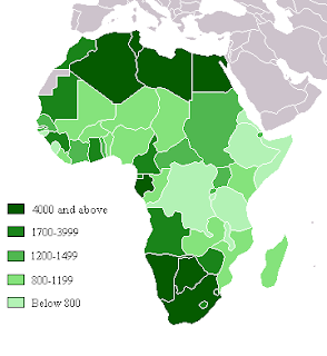
Oddly enough, we have already seen something similar to a choropleth map, as it falls under the category of "Thematic Map". It uses colors or shades to show different levels of statistics. The one shown above shows different levels of gross domestic product in Africa.
Where example was found: http://ahunsberger.blogspot.com/2007/10/examples-of-choropleth-maps_17.html
No comments:
Post a Comment