Tuesday, June 30, 2009

Post 20: Isotachs


Whereas isobars are lines of atmospheric pressure, isotachs are lines representing equal wind speed. Like isobars, however, the lines rarely cross with each other. The example shown is of the isotachs above the US.

Where example was found: http://www.underthemeso.com/blog/?m=200702

Post 19: Isobars


Isobars are lines that are found on certain weather maps that represent a certain amount of atmospheric pressure. Therefore, and Isobaric map is used to map out atmospheric pressure patterns. The one shown above is a simple example of isobars over the US.

Where example was found: http://www.newmediastudio.org/DataDiscovery/Hurr_ED_Center/Hurr_Structure_Energetics/Closed_Isobars/Closed_Isobars.html

Post 18: LIDAR


LIDAR stands for Light Detection And Ranging, and it uses scattered light to track and monitor distant objects. It is commonly used in archeological and geological settings. The map above shows a LIDAR image of Boat Harbor in Homer, Alaska.

Where example was found: http://www.aerometric.com/Gallery/lidar_gallery.html

Post 17: Doppler Radar

Northeast sector

A doppler radar is a weather tool that is used to show how clouds and major weather patterns move. Here in Florida, it is commonly used to track hurricanes. The one shown above shows the weather patterns of the Northeast US.

Where example was found: http://radar.weather.gov/Conus/northeast_lite.php

Post 16: Black and White Aerial Photo


This is another type of map with a self-descriptive name. These photos were more common in earlier days, when color printing was either non-existent or too expensive for common use. This black and white aerial photo shows the stadium of the University of Washington, as well as the surrounding area.

Where example was found: http://www.replayphotos.com/washingtonphotos/stadiums-print/black-and-white-aerial_3282.cfm

Sunday, June 28, 2009

Post 15: Infrared Aerial Photo


Again, this type of map should be pretty self explanatory. It is a picture of an area, taken from a plane or a helicopter, through an infrared lens, allowing those wavelengths to be seen. Above, you can see Lyndon B Johnson National Historical Park in infrared.

Where example was found: http://www.nps.gov/lyjo/naturescience/naturalfeaturesandecosystems.htm

Saturday, June 27, 2009

Post 14: Cartographic Animation


---Typically, a cartographic animation is actually a series of maps showing change. This change may be over a set amount of time, or it may be over a series of general stages. The one above is of the first category; in other words, it is a temporal cartographic animation that depicts change in US population over 65.

Where example was found: http://libraries.maine.edu/Spatial/gisweb/spatdb/gis-lis/gi94078.html

Post 13: Statistical Map


A statistical map is pretty much self-defining: it shows the results of some sort of statistical analysis. Any map that shows the results of a census or a survey can be included in this category. The one above, for example, shows how many people are online in Northern Africa.

Where example was found: http://www.arabdev.org/map

Post 12: Flow Map


A flow map is made to show movement, whether it is in animal migration, in weather patterns, or in something else. In some cases, the amount of movement, or flow, is shown through the thickness of the arrows used. The map I'm using as an example shows the locations of proposed satellite locations in 2006.

Where example was found: http://www.goldensoftware.com/products/mapviewer/mapviewer-maptypes.shtml

Friday, June 26, 2009

Post 11: Isoline Map


Isoline maps show data through the use of lines. There are many different ways of doing this, which means that there are many different types of isoline maps. The one shown above is used by weather services to illustrate where wind speeds of different levels are found in the US at a certain point in time.

Where example was found: http://www.kidsgeo.com/geography-for-kids/0034-isolines.php

Post 10: Proportional Circle Map


This type of map uses circles of different sizes to illustrate different levels of statistical data. The bigger the circle, the larger the statistical value. The Proportional Circle Map that is being shown shows what I believe to be the population size and distribution of an area in Indonesia.

Where example was found: http://jeffhobbs.net/2008/03/26/proportional-circle-maps-in-geomedia/

Post 9: Choropleth Map


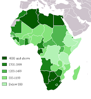
Oddly enough, we have already seen something similar to a choropleth map, as it falls under the category of "Thematic Map". It uses colors or shades to show different levels of statistics. The one shown above shows different levels of gross domestic product in Africa.

Where example was found: http://ahunsberger.blogspot.com/2007/10/examples-of-choropleth-maps_17.html

Post 8: Dot Distribution Map


Dot distribution maps, also known as dot density maps, are often used to analyze population density in some form, whether it is of people, caves, ponds, or a species of animal. The example I have is a maps showing where military families are located in Ohio. Oddly enough, this was found on a 4-H website.

Where example was found: http://operationmilitarykids.ohio4h.org/resources/bycounty.html

Post 7: Propaganda maps


---Propaganda maps are made to convince the viewers of something, usually pertaining to a city or country. Some may be relatively simple, while others, in the case of the map above, are somewhat more outrageous. This map shows a caricature of Europe at war.

Where example was found: http://mooonriver.blogspot.com/2006/11/propaganda-map.html

Post 6: Hypsometric Map


Above is a hypsometric map showing elevation and depth of a part of Southern France. As you can see, it shows this through the use of contours, or lines that outline maps and valleys. This can also be done through the use of different shades, tints, or batches of colors.

Where example was found: http://www.reliefshading.com/colors/hypsometric.html