Tuesday, August 4, 2009
Final Post
This is Joshua Longstreet, signing off--JPL
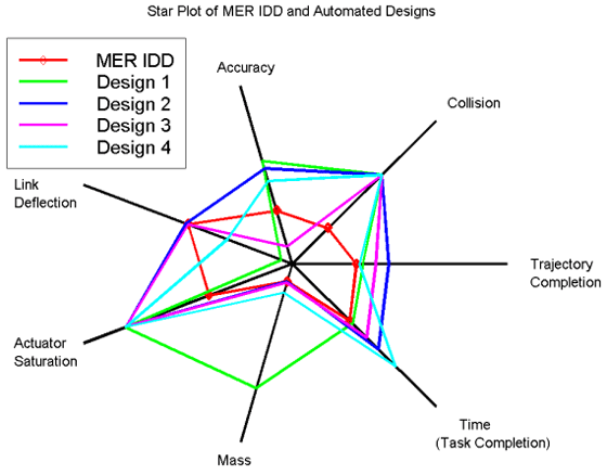
Post 50: Star Plot

A star plot is usually used to measure the characteristics of an object or person. For example, it can be used to compare the speed, strength, endurance, and stamina of two athletes. It can also be called a spider plot. Above is a star plot that examines the abilities of a space shuttle, along with several other, similar designs.
Where example was found: http://upload.wikimedia.org/wikipedia/commons/0/09/MER_Star_Plot.gif
Post 49: Correlation Matrix

Unlike the above example, a correlation matrix is used to determine if there is a relationship between two data sets, rather than if they are a close match. Again, this can be done in several ways, and has a use in both statistics and forensics. This one seems to have been used for more financial purposes, however.
Where example was found: http://www.styleadvisor.com/products/styleadvisor/images/correlation3.gif
Post 48: Similarity Matrix

A similarity matrix shows how closely two data sets match each other. This has found much use in statistics and forensics, as well as sequence alignment. There are several methods of making one; however, due to space constraints, I can only show the one above, which compares what seems to be two sets of medicines.
Where example was found: http://www.biomedcentral.com/content/figures/1471-2164-8-353-5-l.jpg
Post 47: Stem and Leaf Plots

This type of graph is among the first of several items that were taught to me in elementary school. Numerical data is organized so that one can easily analyze the set’s distribution. Arthur Bowley first invented this in the early 1900s. This one was found on an academic website.
Where example was found: http://academic.kellogg.cc.mi.us/secristb/Math%20130%20Online/Course%20Notes/stem_leaf_graph1.gif
Post 46: Box Plots
This type of graph is commonly used to show five number summaries. For those who do not know, five number summaries are: the minimum value of the set, the minimum value of the central 50%, the average, the maximum value of the central 50%, and the maximum value of the set. These are most often used to display population differences. This one shows annual snowfall at a ski resort.
Where example was found: http://edubuzz.org/blogs/nbhs3x1/files/2007/01/boxplot-2.JPG